Have you ever thought about the layout of your blogs?
Most websites just stick with the default option when they’re starting out. If you’re using WordPress, you know there are a few templates to choose from and picking one seems like a matter of personal preference.
But here’s a little secret: Blog layouts are more than just pretty designs. An effective layout can boost your blog’s topic authority. What does that mean for you?
Better ranking in search engine results, that’s what!
Let’s face it; writing an excellent post isn’t enough anymore.
The internet is a crowded place, and to stand out in the search engine results pages (SERPs), you need a layout that not only helps you climb those SERP rankings but also keeps your readers hooked for longer.
More time on your blog equals more chances for engagement and conversions.
So in this post, we’re sharing some killer layout examples. More importantly, we’ll talk about how to choose or create a layout that makes the most of what blogging has to offer.
Let’s get started.
Jump here:
-Understanding Archive and Single Post Blog Layouts
-How to create a strong archive layout that works for you
-5 archive layout examples and best practices to create a strong blog category page
-5 Single post layout examples and best practices to create a strong blog category page
-Turning Insights Into Actions: Your Next Steps for Blog Layouts
Understanding Archive and Single Post Blog Layouts
There are two main types you should be aware of.
Archive Blog Layouts
Think of archive blog layouts as your blog’s directory. Whether you use categories, hubs, or tags, organization is key.
Benefits of a Great Archive Layout
Your archive layout has a major impact on User Experience (UX).
If readers can easily find the topics they’re interested in, they’re more likely to stick around. A well-organized archive page can make the difference between a one-time visitor and a repeat reader.
A well-structured archive also boosts your SEO, specifically your topic authority.
By smartly categorizing or tagging your posts, you’re signalling to search engines that you’re an authority on those subjects. This can help you rank better and gain more visibility in the SERPs.
Single Post Layout
Now, onto the layout of individual blog posts.
This is where you decide on the font size, article width, what’s in the right or left column, and what’s “sticky,” etc..
Each choice affects how engaging your content is for the reader.
Benefits of a Great Single Post Layout
The layout of individual posts affects how easily your readers can digest your content.
A cluttered layout can make even the most compelling blog post difficult to read.
On the flip side, a well-designed layout can make your content more engaging, increasing the time spent on your site and the likelihood of social shares and comments.
But that’s not all. The layout of a single post also plays a role in SEO.
Well-placed headings, easy navigation, and the strategic use of “sticky” elements—like a constantly visible share button or a related articles section—can help with search engine rankings.
When used right, these elements keep the user engaged, reducing bounce rates and signaling to search engines that your content is valuable.
How to create a strong archive layout that works for you
When planning an archive layout, the first step is understanding your audience and your content goals.
If you’re a frequent poster (at least a few times a week), your layout should probably highlight the latest posts while also providing easy access to older content. After all, you’ll have a growing library that should be easy to navigate.
On the flip side, if you post less often (once a week or less) with a focus on SEO, think about giving priority to categories or main topics to build up a few essential SEO content hubs.
So, where to start?
The following process can help you develop the best archive layout for your business:
- Define your objective. Are you aiming for SEO dominance, creating onboarding material, or offering support/help articles like how-to guides?
- Decide what actions users need to take. Do you want them to check out your pricing and services? Purchase an item? Book an appointment? Or are you looking just to keep them informed about industry news in a content marketing approach? This will influence the design.
- Assess your library size. Think about post frequency. This will help decide the number of posts per page and if a search function or additional navigation is needed.
- Spotlight the relevant CTAs. CTAs like newsletter sign-ups or service offers should be relevant and well-placed.
- If you’re a regular blogger, you must have a newsletter sign-up CTA—seriously, don’t skip it.
Then, layer on other CTAs based on your specific objectives set above.
Think of your CTAs as natural pathways to guide users through a journey with you.
If your aim is to get them interested in your services or pricing, strategically sprinkle links at relevant points within the article.
Looking to book appointments? Place that ‘Schedule + Offer’ button where it will have maximum impact, usually after you’ve built some trust through valuable content.
- If you’re a regular blogger, you must have a newsletter sign-up CTA—seriously, don’t skip it.
5 archive layout examples and best practices to create a strong blog category page
A killer archive layout does more than just look good. It hooks your reader with easy navigation, spot-on CTAs, and a smooth user journey.
Here’s our pick of the 5 best archive layouts we’ve seen that combine these elements and elevate them in their own ways.
#1 Bloomscape: The Essentials of Archive Layouts
Bloomscape nails simplicity.
It features a clean design with intuitive navigation. There’s a well-placed search bar for when you’re unsure where to go.

The 5×4 grid layout displays 20 posts per page, making it easy for casual browsing. Just three main categories keep the experience focused.

#2 Clear Voice: Separating Definition Articles From the Rest
Clear Voice’s archive is a blend of utility and smart design choices.
They have 4 archive pages, each has something unique for everyone to learn from. What we want to call out in this article is their “Content Marketing Glossary” page.
If you’re in an industry like SEO or content marketing that’s overflowing with unique terms and phrases, Clear Voice’s approach is worth borrowing.
It’s sorted A-Z, and that’s brilliant because it leaves room for growth without needing to redo the layout design.
And a tip of the hat to their clever placement of 2 CTA buttons.
If you’re good with the glossary, there’s a good chance you’ll want to dig deeper into what they offer. That’s why the service page button is so conveniently up top (20% of your scroll depth).
But hey, if you’re not ready for that level of commitment, they’ve got an e-newsletter signup waiting at the bottom.
It’s like they’re saying, “Not ready to dive in? No worries, let’s keep in touch.”
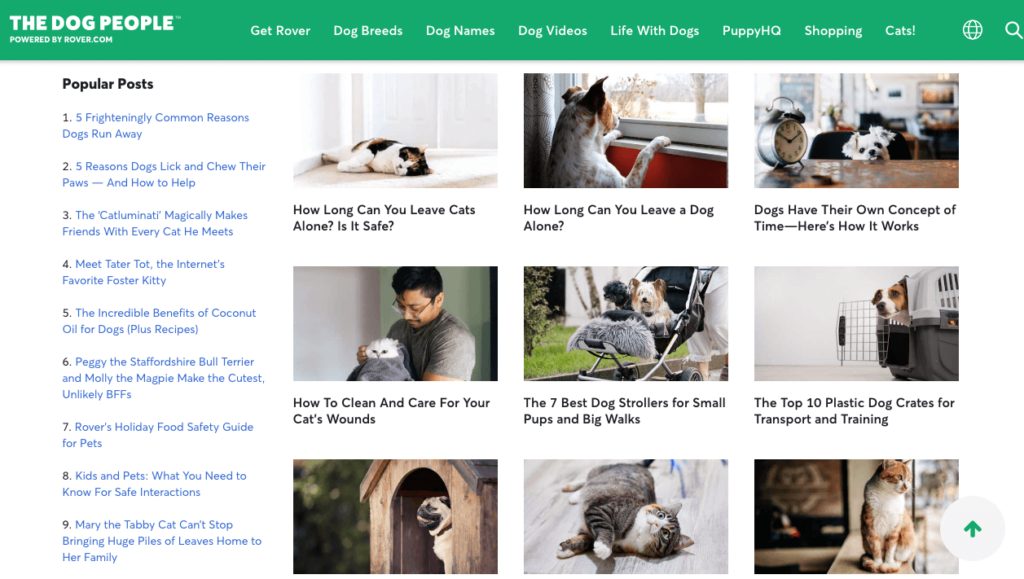
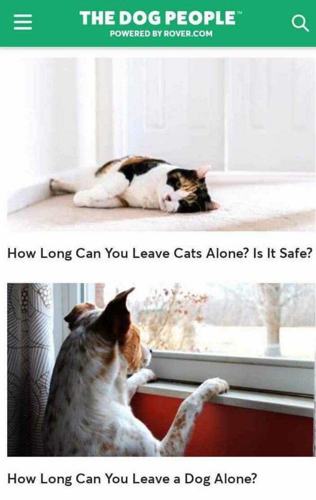
#3 Adapting to Mobile and Keeping it Simple
Rover is like that friend who just gets you.
They have tons of pet content but keep it super simple.
They show you what’s featured, latest, and popular right off the bat. No fuss, just straight to the good stuff.
On mobile, they hide the link-only layout because, let’s face it, it’s a desktop thing.
#4 User-Centric Archives
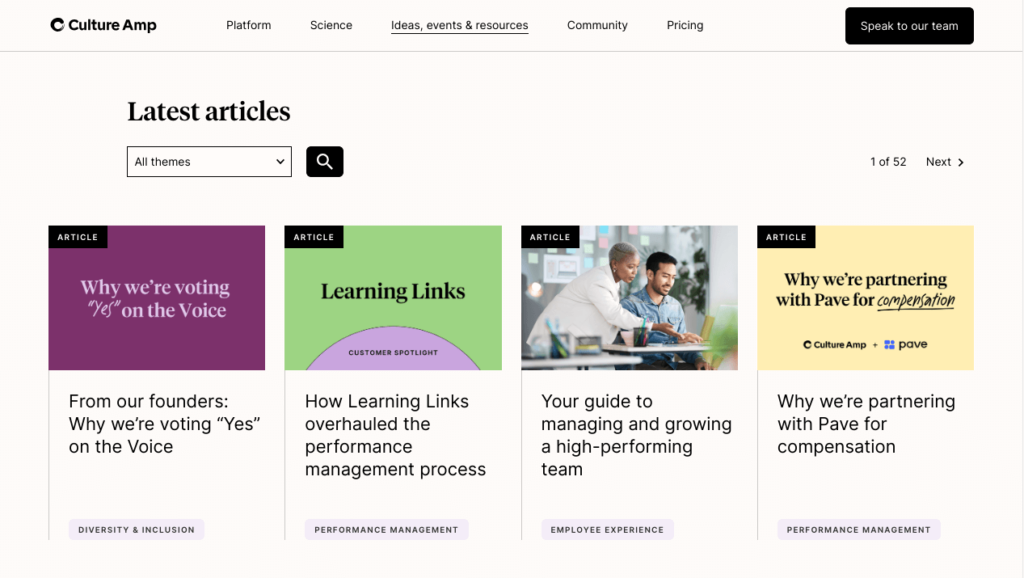
SurveyMonkey’s blog archive takes user-centric design to the next level.
Forget your typical, run-of-the-mill categories. This layout asks you, “Who do you want to talk to?” before diving into topics.
Whether you’re interested in customer feedback, market trends, or employee engagement, the choices are right there.
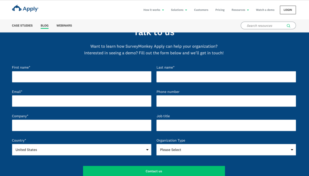
The takeaway here? SurveyMonkey’s archive feels more like a consultation than a list, guiding you to information that actually matters to you.
#5 Master of the Winning Archive Layouts
Kellogg Insight’s layout is a playbook on how to direct reader attention.
The sticky featured article on the left side serves a dual purpose. Not only does it emphasize content the editors think is important, but it also creates a “guide rail” for your eye as you scan the page.
The latest articles on the right offer a constantly updating feed. Imagine it like a Twitter stream, except it’s all quality content related to your interests.
After that, their use of a 4x grid for categories is smart design.
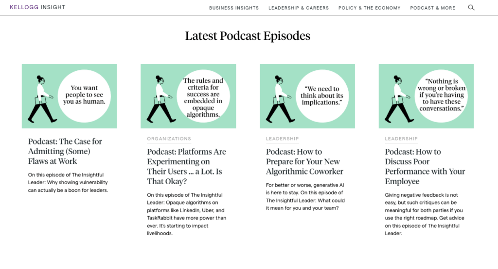
Each podcast uses the same cover image, which not only streamlines the look but also sets it apart from other types of content.
It’s as if each content type gets its own “room” in the layout.
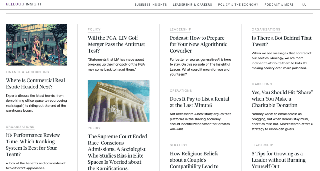
Editor’s picks only show up after you’ve scrolled 60% down the page, which feels natural.
If you’ve scrolled past that much quality content, it’s like the site is saying, “Still looking? Here’s something we think you’ll love.”
5 Single post layout examples and best practices to create a strong blog category page
So you’ve got the archive layout down—awesome. Now, let’s shift gears to single post layouts.
A well-designed single post layout can up your reader engagement big time, guiding them to read more and take action.
Ready for more inspiration? Let’s go!
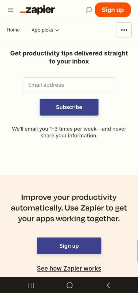
#1 Zapier’s Simple Yet Effective Blog Layout
Zapier’s blog is a testament to the power of minimalist design.
With its 700px width, it’s optimized for readability—no side-to-side eye gymnastics required.
As you scroll, a red progress bar fills up, providing a satisfying visual cue of your reading progress. It’s the little things, you know?

Then, there’s the smartly placed CTA for a 14-day free trial and additional info. It’s not in-your-face, but it’s there when you’re ready to take action.
And if you’re browsing on mobile, that CTA becomes your sticky footer, making it effortless to start your Zapier journey wherever you are.
#2 The Lofty Times 50/50 Layout
Loftie isn’t just great at their main product line; their blog, Lofty Times, takes an unusual yet effective approach to single-post design.
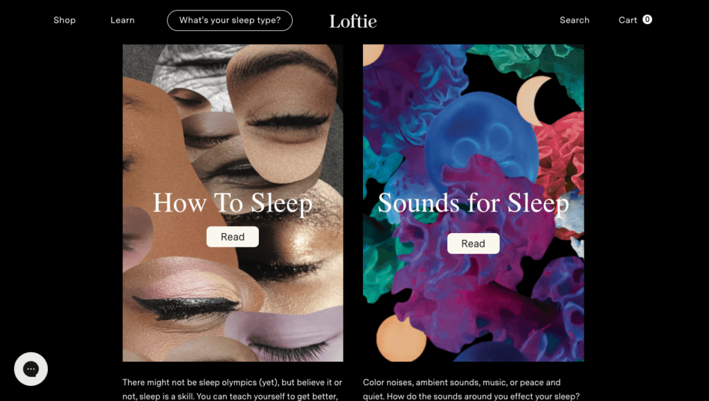
On the left, you’ve got your blog text, formatted at 600px to keep your eyes from wandering.
On the right, a strategically-placed featured image and some slick CTAs invite you to sign up for their newsletter or check out related products.
The design wraps up nicely by showing you relevant articles and those same key product mentions.
It’s a layout that makes you want to read, click, and shop.
#3 Namogoo’s Minimalistic Approach
Namogoo’s blog is a testament to the power of simplicity in design.
It sticks to a single column, making for easy reading, and includes a collapsible table of contents for quick navigation.
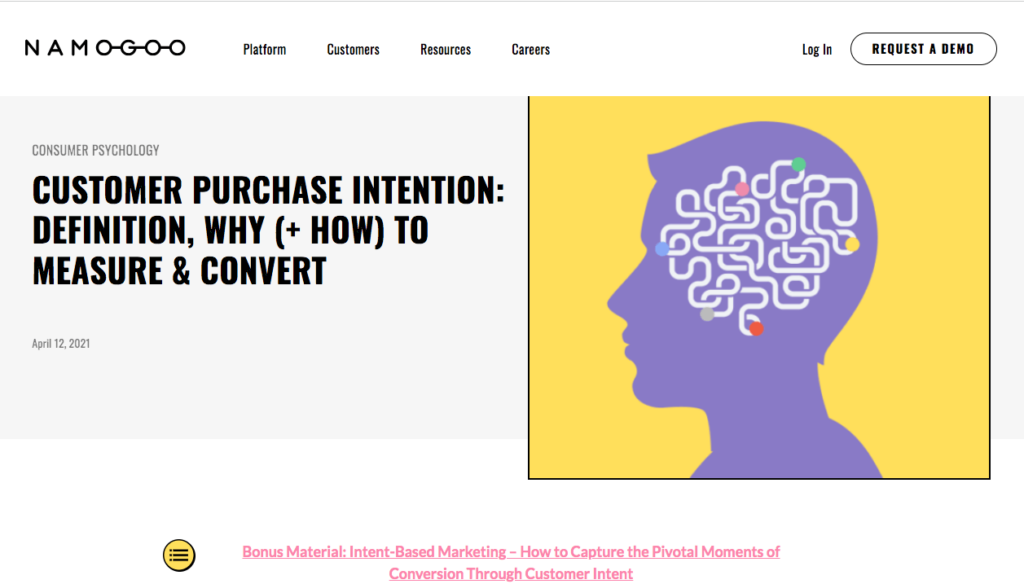
What’s really appealing is what’s not there.
There are no distracting buttons—only relevant links that lead you to more useful articles or a contact request page.
The graphics are also straightforward but effective.
If you’re new to the blogging world, this layout is a great starting point.
#4 Jobber Nails the Art of Multi-layered CTAs in Single Blog Posts
Jobber’s blog is a go-to resource for lawn mowing businesses and other home service companies, and it’s easy to see why.
The multiple-layered CTAs are so well-integrated that they guide without being intrusive.
The blog starts with a reading estimate and two top-of-the-page CTAs for a free trial, making action just a click away.

It’s got an effective breadcrumb navigation, so you always know where you are, and it’s good for SEO too.
Scrolling down, you’ll find even more functional navigation and CTAs: one nudging you toward that free trial again and another inviting you to subscribe to their newsletter.

And just when you think you’re CTA-ed out, they throw in something different—a useful calculator.
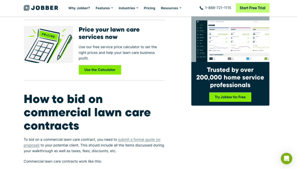
It’s spot-on in relevance and effectiveness.
#5 Casper’s Dual Blog Approach
Casper’s blog offers two types of reading experiences: simple and in-depth.
The straightforward version can feature images—or not—but it’s always easy to read.
Relevant product mentions are conveniently woven in, providing a seamless reading experience without feeling like a constant sales pitch.

They also have an in-depth version that’s almost like a full-blown content hub.
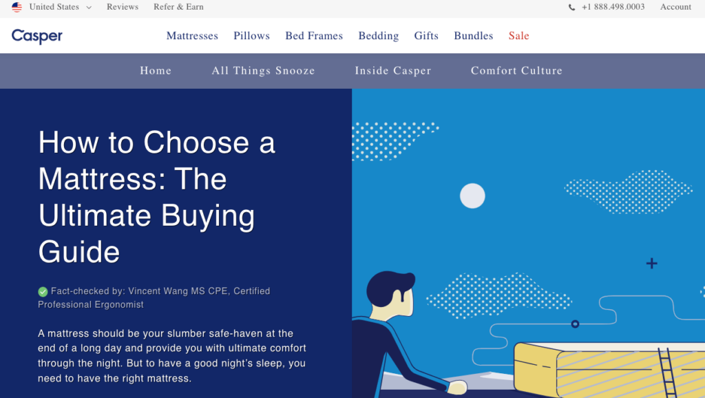
Imagine everything you’d get in a multi-chapter series, neatly packaged into one blog post.
Plus, they’ve invested time in creating custom graphics that not only please the eye but also add real value to the content. It’s a win-win regardless of what you’re in the mood to read.
Turning Insights Into Actions: Your Next Steps for Blog Layouts
There’s more to great blog design than just aesthetics. With the right layout, you’ll notice quicker page loads, increased user engagement, and a boost in your page rankings.
Plus, you’ll be surprised at how effective design can amp up your brand awareness.
It might seem overwhelming now, but trust us—good design pays off in the long run.
Want some help taking things up a notch?
Take a look at our SEO and CRO services; we’re here to help you level up.